Freemix
TL;DR: Logo and icons for artistic app.
This is a story cautionary tale on how a logo design job can go a bit south.
At the end of 2015 I was contracted to design a unique logo for a company that used a free icon until then. They were building an artistic app – a quote from Freemix website should explain best what it’s all about:
Freemix is a free image collage and remix tool
We built it to make creative expression fun, easy, and free to all.
AFAIK the app is still running, but seems to be in vegetative state since second half of 2016. I hope it’s not my fault ;-).
Client wanted something similar to existing “eye in rhombus” thingy, but more unique and less “stock icon”. We planned to redo all the icons from UI after logo is finished – so to base the icons on it.
Note: at the start client asked to show them anything ASAP, so they can point me in their favourite direction without losing my time their money on covering unnecessary grounds. I made a bad neutral questionable decision to agree on that.
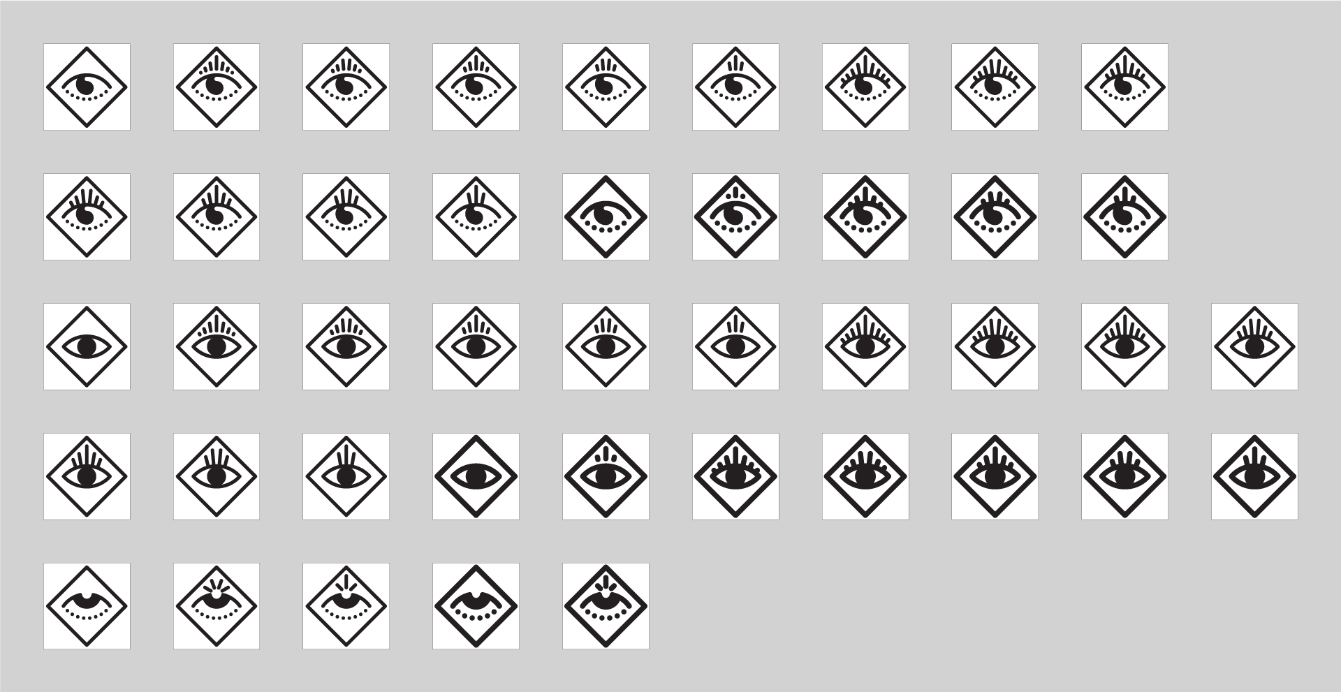
I started with a usual brain-doodle-storming. Eyes are my favourite thing to draw, so it felt soo good drawing them. I was told to leave Rhombus as is, so I did. Unique, funky, charming – these were the directions I was heading. I highlighted the best eyes in my eyes and provided a tiny bit of explanation why these were awesome.
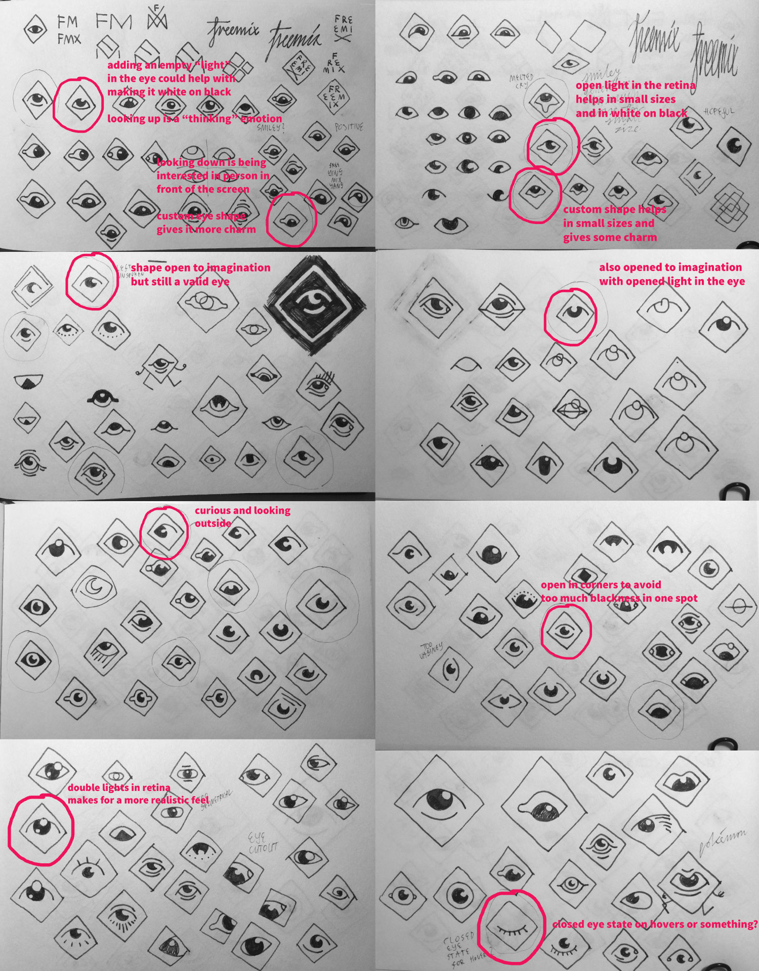
They loved these, but they wanted to see more ideas, more crazy ones. So I gave them these:
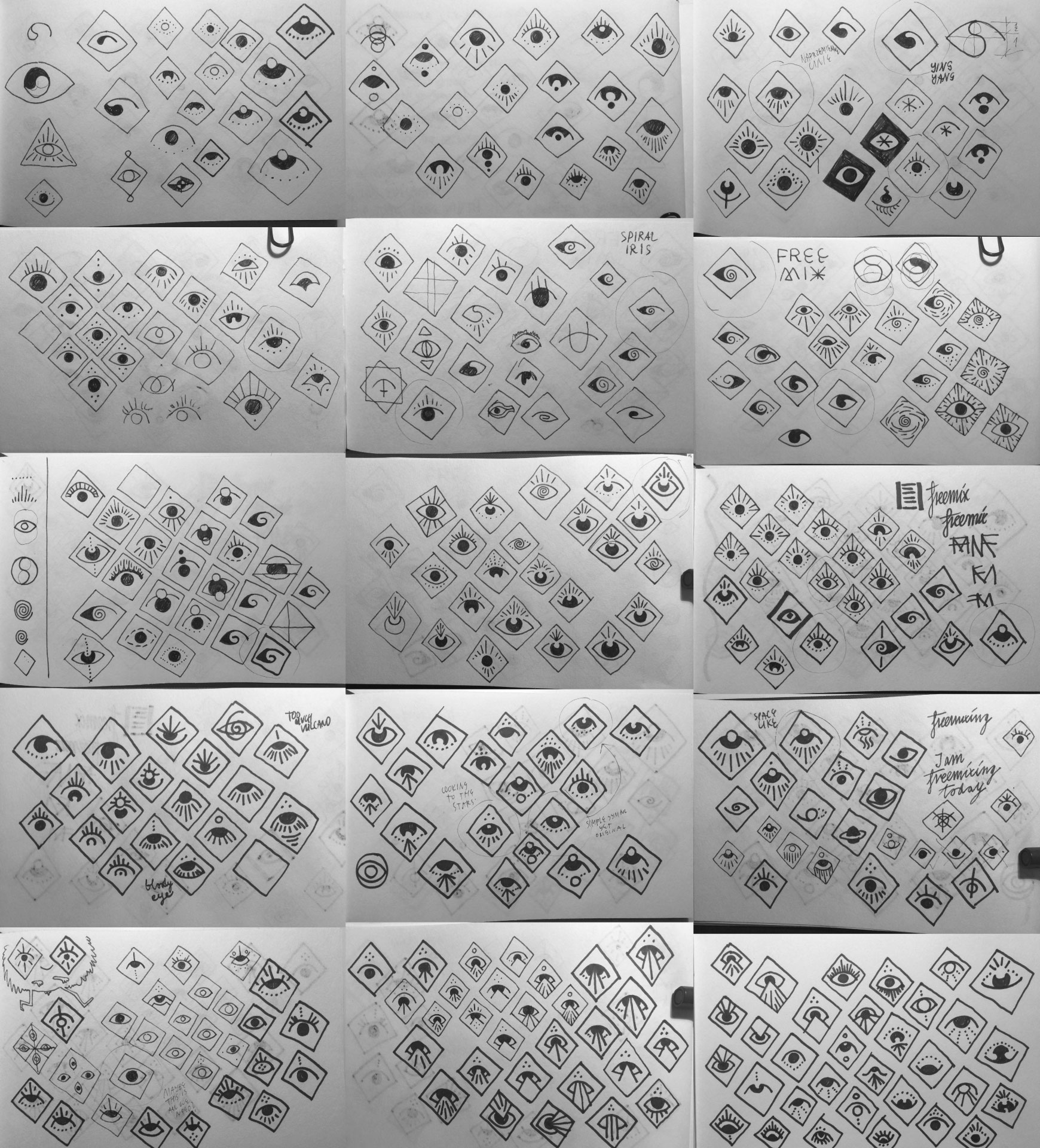
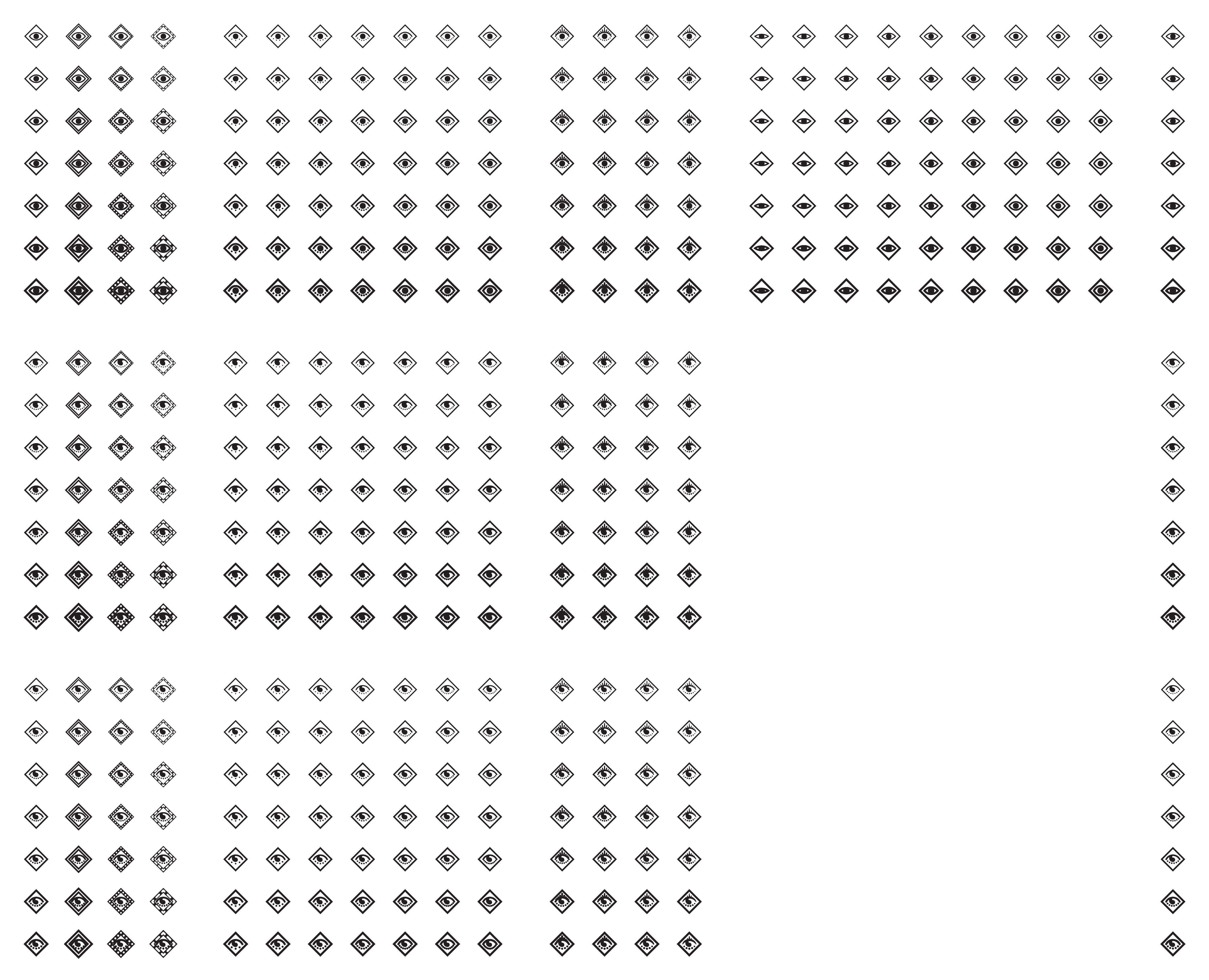
The crazy ones gave us one thing: the client now knew they didn’t want as much uniqueness, but rather more simplicity. With that in mind, they chose few of the ideas for me to take them to The Software™ and make some vectors. At that time my keyboard fu was quite strong, so I was able to manually generate different weights and iterations quite fast.
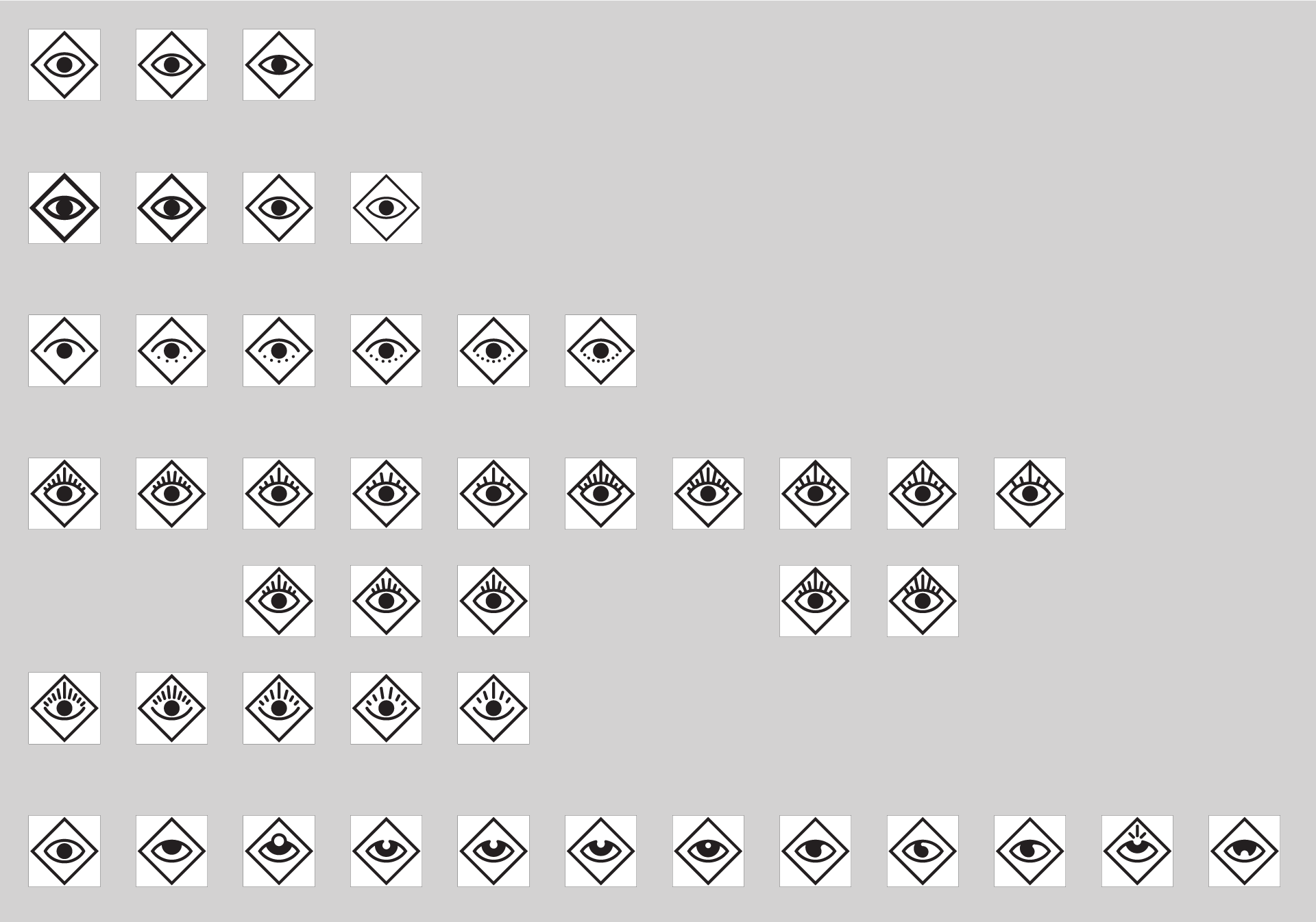
These first designs gave us another thing: the client now no longer knew if they wanted as much simplicity. So I created a few more complex ideas with The Software™.
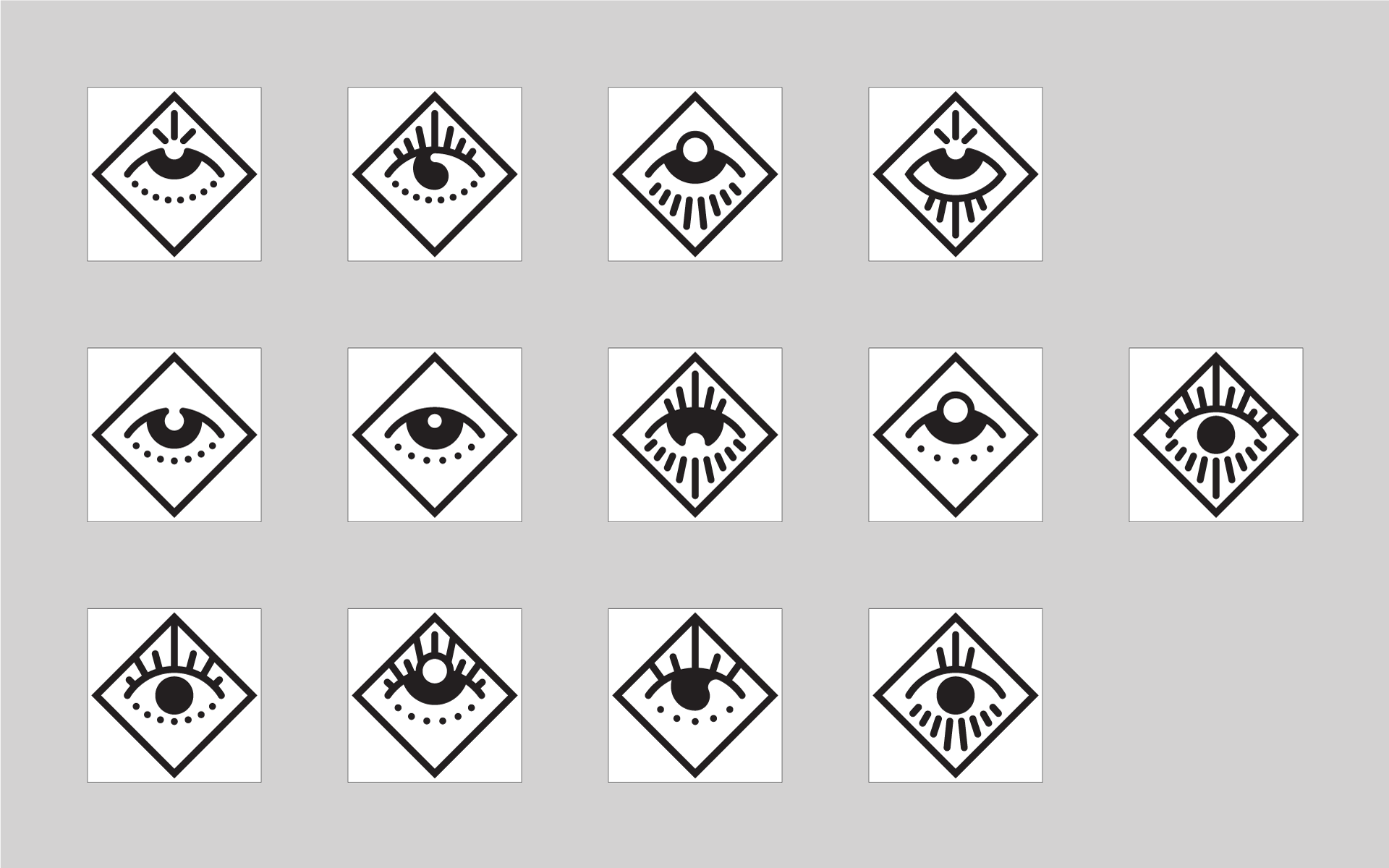
The next step was to mix & match different final final designs and use different weights. As you can see the previous step was a misstep, as simplicity was the thing they wanted after all.
Now I know that it’s better to have limited (or no) choice – as much in daily life as in graphic design. But then I wasn’t able to advise properly. Obviously it was hard for the client to decide if any of these were The One. They asked for more weights and more variations. As a obedient machine I provided. But in contrary to what you may think, it was quite fun making these manually:
After that point I started having problems with reaching the client. After a month or so I got through. We decided to pick one of the designs. We picked one. They just wanted a two more versions (little detail on line endings).
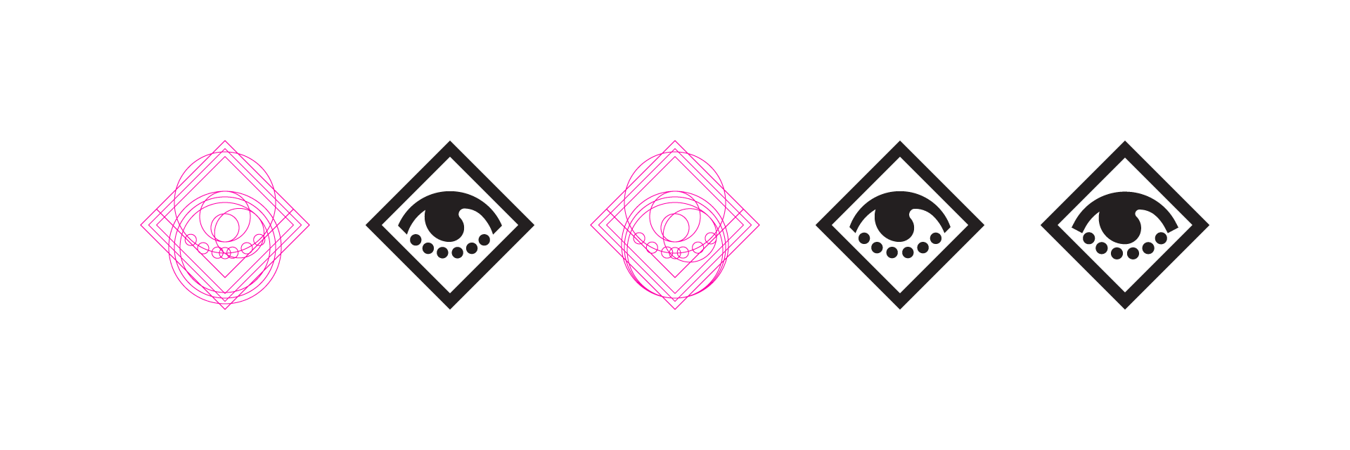
Then a radio silence for another few weeks. And finally! A final final final version of logo! They didn’t use this one, decided to use other one (from a .png preview file).
So what did we learn from all this?
- Choice isn’t always good (in fact most of the times it’s bad)
- I can compete with machines